Visualizing potential distribution phases in the stock market is a crucial skill for investors seeking to make informed decisions and capitalize on market trends. Understanding the dynamics of a distribution phase can provide valuable insights into when to enter or exit positions. In this article, we will explore three effective ways to visualize the start of a potential distribution phase:
1. Volume Analysis:
One of the key indicators of a potential distribution phase is the analysis of trading volume. A spike in trading volume, particularly on days when the price is flat or declining, can signal that institutional investors are unwinding their positions. By monitoring volume patterns and comparing them to historical averages, investors can identify when the market sentiment is shifting towards distribution.
Volume analysis can be visually represented through volume bars or histograms on a price chart. Observing an increase in volume without a corresponding rise in price can indicate that selling pressure is increasing, potentially signaling the start of a distribution phase. Additionally, volume analysis can help confirm other technical indicators and provide a comprehensive picture of market dynamics.
2. Price Patterns and Support Levels:
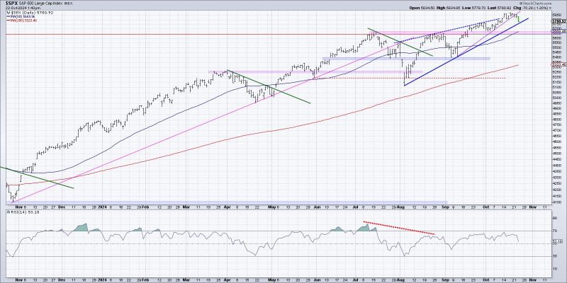
Another effective way to visualize the start of a potential distribution phase is by analyzing price patterns and support levels. Distribution phases often exhibit distinct patterns such as lower highs, a series of tight trading ranges, or prolonged consolidation after a strong uptrend. These patterns suggest that market participants are gradually offloading their positions and that supply is starting to exceed demand.
By plotting support levels on a price chart, investors can identify key levels where buyers are likely to step in and provide support. A breakdown below these support levels, accompanied by increasing volume, can indicate that the distribution phase is gaining momentum. Visualizing price patterns and support levels can help investors anticipate potential downside risk and adjust their trading strategies accordingly.
3. Relative Strength and Market Breadth:
Monitoring relative strength and market breadth can also provide valuable insights into the start of a potential distribution phase. Relative strength analysis compares the performance of a specific stock or sector against a benchmark index, illustrating whether it is outperforming or underperforming the broader market. A divergence in relative strength, where a stock shows weak performance despite the overall market trending higher, can be a warning sign of distribution.
Market breadth, which measures the number of advancing and declining stocks, can help assess the overall health of the market. A narrowing breadth, with fewer stocks participating in an uptrend, can suggest that the market is losing momentum and transitioning into a distribution phase. Visualizing relative strength and market breadth through charts and technical indicators can provide investors with a broader perspective on market conditions and potential distribution trends.
In conclusion, visualizing the start of a potential distribution phase in the stock market requires a comprehensive analysis of volume, price patterns, support levels, relative strength, and market breadth. By incorporating these visual indicators into their decision-making process, investors can better navigate market cycles, identify key turning points, and position themselves strategically to capitalize on emerging trends. Developing a keen eye for visualizing distribution phases can enhance trading proficiency and empower investors to make more informed and profitable decisions in dynamic market environments.


